KorGE include some UI components, you can use out of the box.
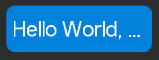
UIButton
UIButton is a basic button, that supports both text and icons. It automatically includes ellipsis for long texts.
uiButton("Hello World, this is a button!")
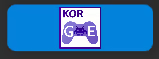
uiButton(icon = resourcesVfs["korge.png"].readBitmapSlice())
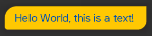
It is possible to adjust some of the visual properties of the UIButton:
uiButton("Hello World, this is a text!").also {
    it.width = 190f
    it.bgColorOut = MaterialColors.AMBER_500
    it.bgColorOver = MaterialColors.AMBER_800
    it.textColor = MaterialColors.BLUE_900
    it.background.radius = RectCorners(16f, 0f, 12f, 4f)
}
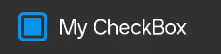
UICheckBox
For desktop interfaces, where you need a toggleable setting, you can use UICheckBox.
uiCheckBox(text = "My CheckBox", checked = true)
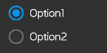
UIRadioButton / UIRadioButtonGroup
For desktop interfaces where you need a set of options where all are displayed but only one is selected,
you can use UIRadioButton.
val group = UIRadioButtonGroup()
uiVerticalStack {
    uiRadioButton(text = "Option1", group = group)
    uiRadioButton(text = "Option2", group = group)
}
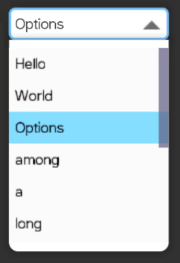
UIComboBox
A ComboBox / DropDown / Select that drops a list of elements the user can select.
uiComboBox(size = Size(160f, 32f), items = listOf("Hello", "World", "Options", "among", "a", "long", "list", "of", "options", "where", "scrolling", "appears"), selectedIndex = 2)
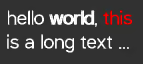
TextBlock
This is a text supporting rich text data, ellipsis, text wrapping, etc.
textBlock(
    RichTextData.fromHTML(
        "hello <b>world</b>, <font color=red>this</font> is a long text that won't fit!",
        RichTextData.Style.DEFAULT.copy(font = DefaultTtfFontAsBitmap)
    ),
    size = Size(100f, 48f)
)
UIText
This is a UIView wrapping a plain KorGE Text. For word wrapping, etc. using TextBlock instead.
uiText("Hello World!")

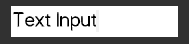
UITextInput
uiTextInput("Text Input")
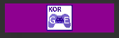
UIImage
UIImage allows to render an image using a ScaleMode and a ContentAnchor to fit/cover within the view bounds.
solidRect(Size(120f, 32f), Colors.PURPLE)
uiImage(Size(120f, 32f), KR.korge.read().slice(), scaleMode = ScaleMode.FIT, contentAnchor = Anchor.CENTER)
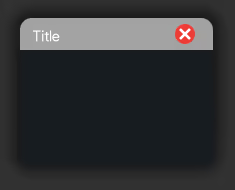
UIWindow
A draggable, resizable and closeable window.
UIProgressBar
uiProgressBar(size = Size(256, 8), current = 75f, maximum = 100f)

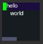
UITreeView
A bit rusty Tree View to render collapsable trees.
uiTreeView(UITreeViewList(listOf(
    UITreeViewNode("hello", listOf(
        UITreeViewNode("world")
    ))
)), size = Size(100, 100))
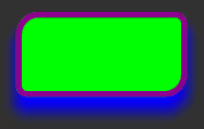
UIMaterialLayer
A Material Layer is a rounded rectangle that can has a border, a drop shadow, rounded corners and a background color.
uiMaterialLayer().also {
    it.size = Size(120f, 60f)
    it.radius = RectCorners(16f, 8f)
    it.shadowColor = Colors.BLUE
    it.shadowRadius = 10f
    it.shadowOffset = Vector2.polar(90.degrees, 10f, Vector2.UP_SCREEN)
    it.bgColor = Colors.GREEN
    it.borderColor = Colors.PURPLE
    it.borderSize = 4f
}
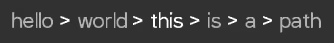
UIBreadCrumb
uiBreadCrumb(listOf("hello", "world", "this", "is", "a", "path"))
UIEditableNumber
This allows the user to edit a number, while allowing to drag & drop or click to adjust it.
uiEditableNumber(10.0, min = 0.0, max = 100.0)

UISlider
A slider to select a number in a range.
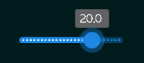
uiSlider(value = 50.0, min = -50.0, max = +50.0, step = 1.0) {
    showTooltip = true
    marks = true
    textTransformer = { "${it}" }
    decimalPlaces = 2
    styles {
        uiSelectedColor = MaterialColors.RED_600
        uiBackgroundColor = MaterialColors.BLUE_50
    }
    changed {
        println("SLIDER changed to $it")
    }
}
It is possible to show or disable marks with slider.marks = true/false.
Configuring slider tooltips
You can configure tooltips with slider.showTooltips:
slider.showTooltips = true // always show tooltips
slider.showTooltips = false // never show tooltips
slider.showTooltips = null // the default: show only while dragging
Configuring slider marks
Some small dots can be configured to visually display steps inside the slider.
slider.marks = true // show slider marks
slider.marks = false // hides slider marks
Configuring tooltip text
It is possible to configure the tooltip text transforming the value:
slider.textTransformer = { "${it}º" }
Tooltip decimal places
It is possible to configure the tooltip decimal places with:
slider.decimalPlaces = null // auto-configured based on the step
slider.decimalPlaces = 2 // 2 decimal places X.YY
Subscribing to tooltip changes
To subscribe to changes to the slider:
slider.onChange.add { println("Slider changed to $it") }
slider.changed { newValue -> println("Slider changed to $newValue") }
Styling
It is possible to adjust the color of the slider:
slider.styles {
    uiSelectedColor = MaterialColors.RED_600
    uiBackgroundColor = MaterialColors.BLUE_50
}
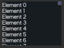
UIVerticalList
Lazily computed for elements vertical list. It is aware of container bounds, so it will only generate and display elements that are visible.
uiScrollable(Size(160, 120)) {
    uiVerticalList(object : UIVerticalList.Provider {
        override val fixedHeight: Float? get() = 16f
        override val numItems: Int get() = 1000
        override fun getItemHeight(index: Int): Float = 16f

        override fun getItemView(index: Int, vlist: UIVerticalList): View {
            return TextBlock(RichTextData.fromHTML("Element $index"))
        }
    }, width = 160f)
}
UISpacer
uiVerticalStack {
    uiButton("")
    uiButton("")
    uiSpacing(Size(0, 10))
    uiButton("")
}
Layouts
UIScrollableContainer
uiScrollable(Size(300, 300)) {
    image(resourcesVfs["korge.png"].readBitmapSlice())
}
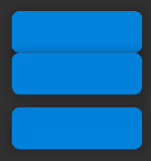
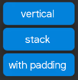
UIVerticalStack
To arrange elements vertically.
uiVerticalStack(padding = 4f) {
    uiButton("vertical")
    uiButton("stack")
    uiButton("with padding")
}
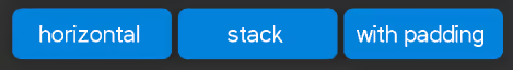
UIHorizontalStack
To arrange elements horizontally.
uiHorizontalStack(padding = 4f) {
    uiButton("horizontal")
    uiButton("stack")
    uiButton("with padding")
}
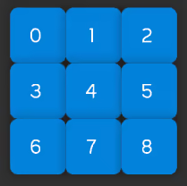
UIGridFill
To arrange elements in a table shape.
uiGridFill(cols = 3, rows = 3) {
    for (n in 0 until 9) uiButton("$n")
}
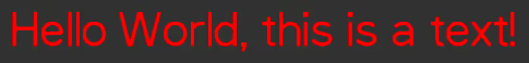
Styling
It is possible to style some components. As long as you attach styles to a UIContainer, all its descendants will use that style.
uiContainer {
    styles {
        this.textColor = Colors.RED
        this.textSize = 32f
    }
    uiText("Hello World, this is a text!")
}